

Shinken
Shinken, stylised as “SHINKEN”, approached me with a finished logo done in-house however felt it was too busy and wanted it cleaning up, due to its lack of flexibility and scalability.
The initial meeting helped us gain clarity over the desired aesthetic for the brand, in which we created a moodboard of inspiration and metaphors for the brands story.
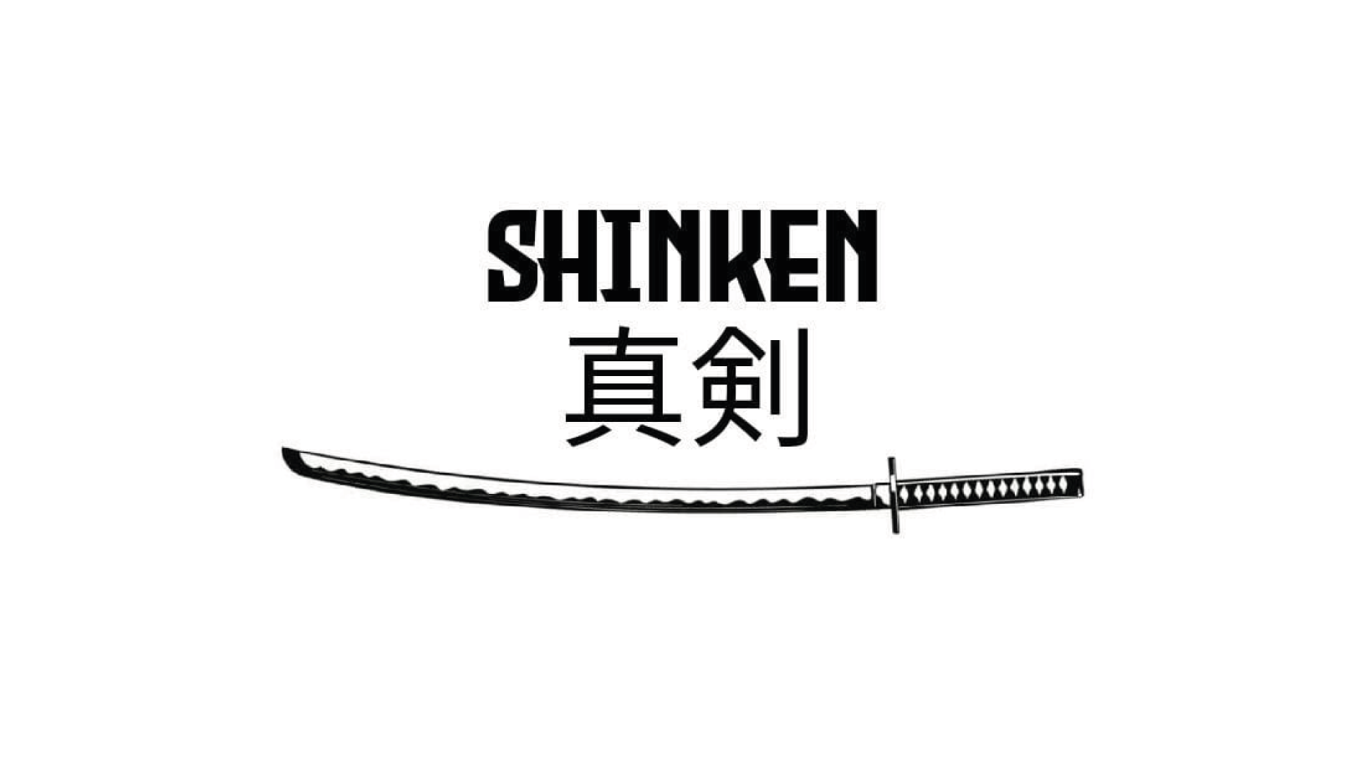

A Shinken is a type of Japanese sword, with a forged sharp blade. In order for the blade to have no imperfections and remain at its sharpest, it is sharpened when not in use and kept in best condition. This was the first metaphor we found between gym lifts and the sharpening of a shinken. The Deadlift, for example, must have zero inefficiencies in the lifters form in order to be at max power. It is also continually worked on to achieve the best form that is individual to the lifter due to anatomy and types of deadlifts. More importantly, any inefficiencies can lead to harm on the lifters spine. This lead to the second metaphor.
Carrying on from the metaphor of the shinken, it pushed me to look into the anatomy of the sword as each individual part is named. One that stood out was the Tsuba, which is the round disc placed above the handle. There were many similarities found between the reason behind the tsuba and a lever belt, including protection, centre points, functionality and status symbols. The reason behind the hexagonal tsuba shape is influenced by barbell clips of the same shape, also used for protection and security.

The conceptual stage explored many themes, but it was important to not stray too far from the key words given which was grunge and Japanese inspired. After some feedback, we began to combine concepts and three logos were generated to fit into different sized containers. Each logo contained the tsuba, sword, and brand name.
The primary logo was to fit horizontal products such as the belt, and contained the sword within type, to replicate the scratch in akatsuki headbands found in in the Naruto TV series. The stacked the logo features the sword with the handle in the K, the tsuba in the centre, in-line with the I above. Then the alternate logo features all assets above one another to resemble the original logo.